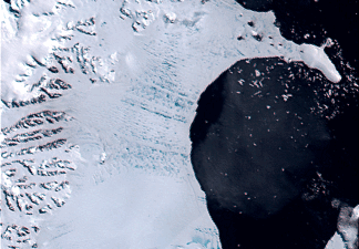
SVS Animation 3338 - Tropospheric Ozone Impacts Global Climate Warming
This weeks blog focuses on maps and their use in world events, better known as the news. No matter where you go for a dose of the news you will notice an increase mapped images. A recent trend among news papers and television news broadcasts is the use of maps to support information. Maps have always been used to depict our geographical world in a compact and easy-to-understand piece of paper but current trends in news reporting have created an employment nitch for professional cartographers. The use of maps in everyday news reports not only helps support a reporters view point, it examines the report in a fundamentally different fashion. The above link (tropospheric Ozone Impacts) takes you to a site that has complied information over a 100 year period and presented it through a map. It's a fair to say that most people have heard about global warming at one point or another in the news. The map in this link depicts global warming like no news report could ever hope to-check it out, you'll be amazed.
The following site http://www.newseum.org/todaysfrontpages/flash/ attempts to take cartography to another level in terms of maps and the news. This site allows you to visit nearly every major news paper publication in the world from the comfort of your computer. Using a world map, all the major newspapers are represented like attributes, when you click on an attribute it opens the local news paper and you are allowed read the frontpage articles if you like what your reading there's a link that takes you to the newspapers website. This site is so cool I've given it a perminate spot in my links list.
Saturday, February 24, 2007
Saturday, February 17, 2007
Interactive and animated map use
Interactive and animated maps are rising in popularity among cartographers and novice map makers, surprising misrepresentations can surface with improper use of animation. Following the idea of Map fact, Map fiction blog I thought it might be nice to look at a scholarly article that talks about a very important element in maps, the legend. Nearly anyone who analyzes a map is forced to look at the legend for needed information. The importance of good a animated/interactive legend can make all the difference in the world. According to Menno-Jan Kraak, Rob Edsall, and Alan M. MacEachren at Pennsylvania State University "choices among them [legends] should be made with regard to the nature of the temporal data" (Menno-Jan Kraak, Rob Edsall, and Alan M. MacEachren, 2002). Too many map makers are creating interactive map legends that misrepresent the maps data. Take a look at the article link "interactive and animated legend use" at the top of the page. It provides a great deal of information regarding proper legend use and a test to help you determine if the choices you make best represent the data in your maps. I've also included a few interactive map sites to my links list that might provide further knowledge on the matter, check them out if you get a chance I think they are pretty cool. I have also found a cool article http://www-psych.stanford.edu/~bt/diagrams/papers/tversky_betrancourt.pdf that talks about the ability of maps to display animation and not violate the "Apprehension Principle" (Mireille Betrancourt, 2002).
Sunday, February 11, 2007
Maps and the American identity

My blog entry this week entails a look at maps and the American identity. There are a number of cultural markers that make us 'American' such as Baseball or perhaps a cheeseburger some have even claimed that our attitude is unique among the worlds people. For me, to think about what it means to be American reminds me of something my grandfather who was full blooded Yaqui Indian said me once, “to be an American means to live in a land built on the backs of African slaves wading through the blood of its native peoples”. I don’t know where he heard it but it has always stuck with me. After a bit of research I discovered a couple of cool maps, the first is a map that depicts the Yaqui people and their native lands the other (figure 1.5) uses current Native American census information to create a map that relies heavily on Hue but remains effective. The over all design of this map is clean despite its many colors. Ideally, a professional cartographer would use between 3-7 different colors, any more then this often leads to confusion. Can we trust this map? According to this map native peoples are doing well as they seem to cover the entire map, obviously a map like this has great potential to lie. Perhaps not on purpose but all the same, how statistical information is represented can easily be manipulated and a map such as this is a prime example of information that seems a bit skewed. I have created a link to this site, organized by the Census Scope, for those of you who would like a more in-depth look.
Figure 1.5
Figure 1.5

Sunday, February 4, 2007
Map Fact and Fiction
Factual and Fictional Maps
This week’s blog pertains to maps based in fact and or fiction. A fair number of flat maps based in fact are in actuality ‘fictional’ as they cannot represent all five mapping components (distance, direction, shape, area, and proximity). For example, figure 1.3 is a map of the island of Maui one of the islands of the Hawaii chain. This map is a good factual map as it represents several of the standard elements a flat map should have in its over all design and content. The Maui map gives the reader a basic idea of the shape and area of the island. Color is also used to represent not only elevation but terrain as well. The map portrays the graphics of towns and cities as red or black dots and uses other symbols that are easily identified as they are commonly used in a number of tourist maps. For example, a park has the symbol of a tree and a fishing area has the symbol of a fish. Balance is portrayed with the use of a smaller island located in the bottom left hand corner. This smaller landmass gives the consumer an idea of the size Maui island. Figure 1.3 is not without fault as this map lacks some of the most basic elements such as a direction arrow and a proper legend.
Figure 1.4 represents a fictional map of the world that Flash Gordon crashed on during his initial adventures. This map despite its obvious lack of use in the real world has some very interesting components. The over all design appears cramped by the excessive use of color, yet the color acts as a legend of sorts and helps the consumer identify specific locations according to the geographic arrangement of that area. The map’s graphics are very plain and are not as useful as those in figure 1.3 as they do not depict elevation or terrain. The over all balance of the map is displayed by the use of water dragons and the general location of the landmass itself. As in figure 1.3, Flash Gordon’s map does not have a directional arrow or a distance scale but does it really need one? This map is fictional and is supposed to represent another planet, perhaps their planet does not have a north pole. Over all both maps are good and can be useful depending on what the consumer is looking for.
Figure 1.3

Figure 1.4

Subscribe to:
Comments (Atom)


